.webp)



In this step, you add the Acme stylesheet. It uses the merchant's colours, so the store owner can change them without a code change.
What you'll build
public/themes/acme/css/acme.css, loaded by the layout- Colours that follow the merchant's settings in Commera
1. Put assets in the public folder
The browser loads files from your app's public/themes/<theme folder>/ folder. The bench serves them at /assets/<app>/themes/<theme folder>/.... For Acme:
| File on disk | URL |
|---|---|
acme_theme/public/themes/acme/css/acme.css |
/assets/acme_theme/themes/acme/css/acme.css |
acme_theme/public/themes/acme/images/hero.webp |
/assets/acme_theme/themes/acme/images/hero.webp |
Do not write these URLs by hand in a template. Use shop_theme_asset_url() with the path inside the theme's public folder:
<link rel="stylesheet" href="{{ shop_theme_asset_url('css/acme.css') }}">
shop_theme_asset_url() looks for the file in the active theme, then in each parent theme, and returns the URL of the first match. A child theme can use its parent's scripts and images without a copy.
2. Use the merchant's colours
Shop Base Theme prints the merchant's colours on every page as CSS variables, from format_theme_css(). The merchant sets them in Commera's settings. Use the variables in your CSS:
| Variable | Use it for |
|---|---|
--ls-primary, --ls-primary-hover |
The main brand colour |
--ls-button-bg |
Buttons |
--ls-link, --ls-link-hover |
Links |
--ls-footer-bg, --ls-footer-text |
The footer |
--ls-accent, --ls-secondary-accent, --ls-heading-accent, --ls-border-accent |
Accents |
--ls-badge-bg, --ls-strikethrough, --ls-focus-ring, --ls-form-accent, --ls-brand-text, --ls-carousel-dot |
Badges, old prices, focus rings, form controls, brand text, slider dots |
3. Add the stylesheet
Create acme_theme/public/themes/acme/css/acme.css:
:root {
	--acme-radius: 12px;
	--acme-gap: 24px;
	--acme-muted: #6b7280;
}

body.theme-acme {
	margin: 0;
	font-family: system-ui, -apple-system, "Segoe UI", sans-serif;
	color: #111827;
	background: #fafaf9;
	min-height: 100vh;
	display: flex;
	flex-direction: column;
}
.theme-acme main { flex: 1; }

.theme-acme a { color: var(--ls-link); text-decoration: none; }
.theme-acme a:hover { color: var(--ls-link-hover); }

.acme-header {
	display: flex;
	align-items: center;
	justify-content: space-between;
	padding: 16px 32px;
	background: #fff;
	border-bottom: 3px solid var(--ls-primary);
}
.acme-logo { height: 40px; width: auto; }
.acme-nav { display: flex; gap: var(--acme-gap); font-weight: 600; }

.acme-hero {
	padding: 72px 32px;
	text-align: center;
	background: var(--ls-primary);
	color: #fff;
}
.acme-hero h1 { margin: 0 0 8px; font-size: 40px; font-weight: 700; }
.acme-hero p { margin: 0 0 24px; font-size: 18px; opacity: 0.9; }
.acme-hero .acme-button { background: #fff; color: var(--ls-primary); }

.acme-section { max-width: 1200px; margin: 0 auto; padding: 48px 32px; }
.acme-section h2 { margin: 0 0 24px; font-size: 28px; font-weight: 700; }
.acme-grid {
	display: grid;
	grid-template-columns: repeat(auto-fill, minmax(220px, 1fr));
	gap: var(--acme-gap);
}

.acme-card {
	display: flex;
	flex-direction: column;
	gap: 8px;
	padding: 12px;
	background: #fff;
	border-radius: var(--acme-radius);
	box-shadow: 0 1px 3px rgb(0 0 0 / 0.08);
}
.theme-acme .acme-card { color: inherit; }
.acme-card img { width: 100%; aspect-ratio: 1 / 1; object-fit: cover; border-radius: 8px; }
.acme-card-title { font-weight: 600; }

.acme-price { font-weight: 700; color: var(--ls-primary); }

.acme-button {
	display: inline-block;
	padding: 12px 28px;
	border: 0;
	border-radius: 999px;
	background: var(--ls-button-bg);
	color: #fff;
	font-weight: 600;
	cursor: pointer;
}
.acme-button:hover { background: var(--ls-primary-hover); }
.acme-button:disabled { opacity: 0.5; cursor: not-allowed; }

.acme-product {
	display: grid;
	grid-template-columns: 1fr 1fr;
	gap: 48px;
	max-width: 1100px;
	margin: 0 auto;
	padding: 48px 32px;
}
.acme-product-image { width: 100%; border-radius: var(--acme-radius); }
.acme-product-info h1 { margin: 0 0 12px; font-size: 32px; font-weight: 700; }
.acme-product-info .acme-price { font-size: 28px; }
.acme-sizes { display: flex; flex-wrap: wrap; gap: 8px; margin: 24px 0; }
.acme-size { padding: 8px 16px; border: 1px solid #d1d5db; border-radius: 8px; background: #fff; cursor: pointer; }
.acme-size.is-selected { border-color: var(--ls-primary); color: var(--ls-primary); font-weight: 700; }

.acme-footer {
	padding: 32px;
	text-align: center;
	background: var(--ls-footer-bg);
	color: var(--ls-footer-text);
}

@media (max-width: 768px) {
	.acme-header { padding: 16px; }
	.acme-product { grid-template-columns: 1fr; padding: 24px 16px; }
	.acme-section { padding: 32px 16px; }
}
The layout from step 2 loads this file after Commera's tailwind.css. Plain CSS without a layer wins over Tailwind's layered styles, so your rules apply.
Check it works
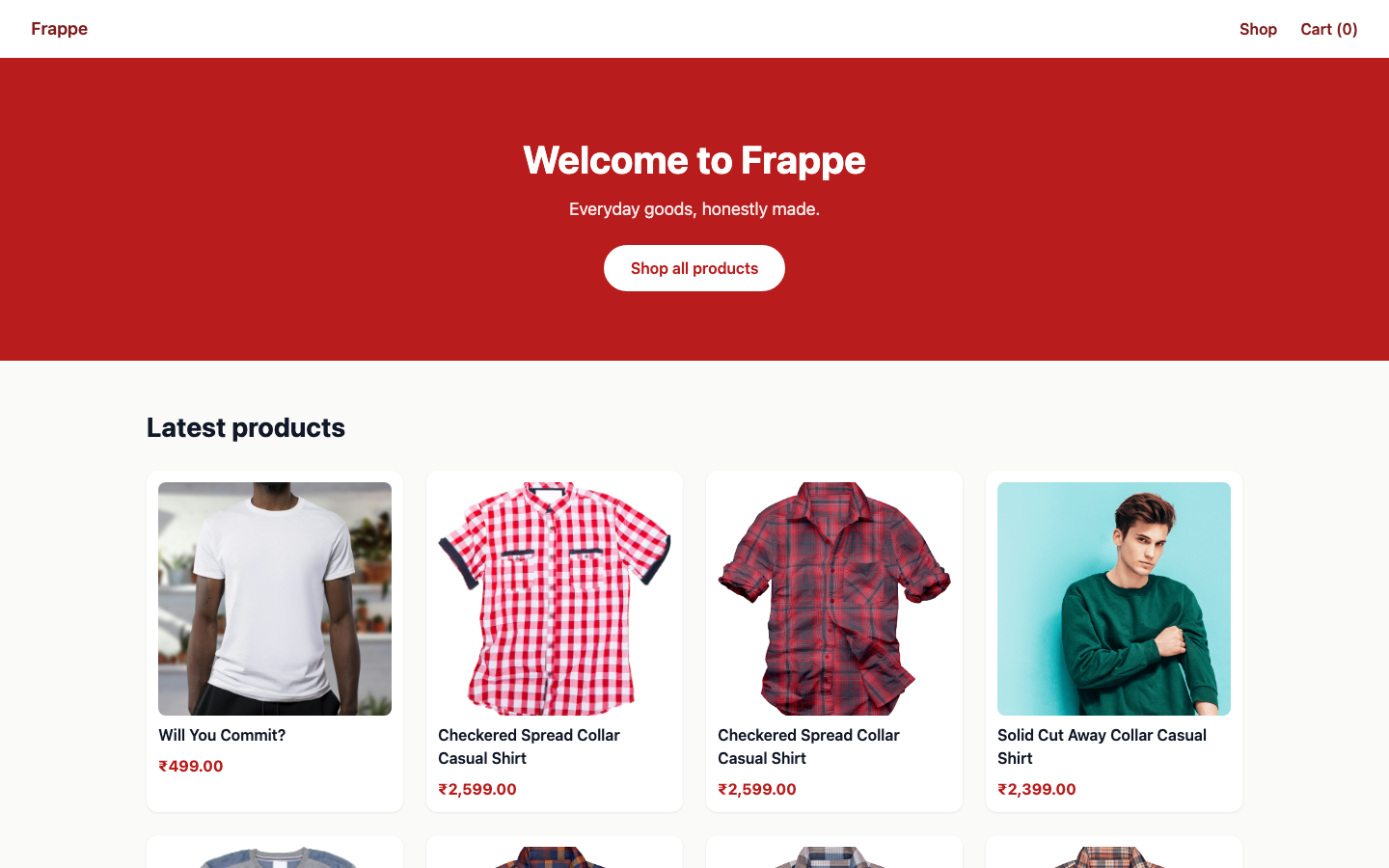
Open /en?preview_theme=Acme. The home page has the Acme header, a hero in the merchant's primary colour, and the eight newest products:
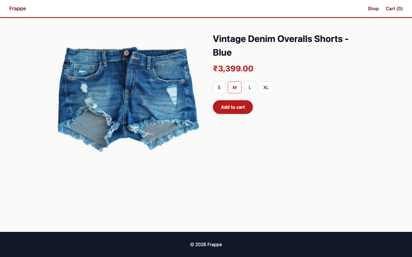
Open a product with ?preview_theme=Acme&size=M. Click Add to cart. The toast shows, and the header shows Cart (1).
Optional: build Tailwind for your theme
Acme is plain CSS. To write a theme with Tailwind CSS v4 instead, give the theme its own build:
-
In your app, add
@tailwindcss/cliandtailwindcssversion 4 as dev dependencies. -
Create
acme_theme/themes/acme/tailwind.input.css:@import "tailwindcss"; @import "./styles/tokens.css"; -
Put your theme's tokens and custom rules in
styles/. Put custom rules in@layer components. -
Build from inside the theme folder:
cd acme_theme/themes/acme npx @tailwindcss/cli -i tailwind.input.css -o ../../public/themes/acme/tailwind.output.css --minify -
Load the output in the layout's
headblock withshop_theme_asset_url('tailwind.output.css'). -
Commit the output file.
bench builddoes not run this build.
Shop Default Theme uses this setup. Read its tailwind.input.css and styles/tokens.css for a working example. Do not use its components/base.html as a model for your layout. It is an older copy.
Next steps
- Step 5: Override a theme
- Architecture: how assets fall back to a parent theme